What can McDonald's teach us about our dollars?
The elegant insight of Ronald McDonald.


My monthly spending has been out of control. Yesterday I walked out of my favorite coffee shop with a latte that cost me $7.50. Admittedly it was a 16oz cup. But it felt outlandish. When did coffee become so expensive? I swear I paid 5 bucks for it back in university - around 2008.
Back then I had hope for financial independence. When doing my spreadsheets with all my retirement numbers, I always made sure to include an estimate for the rate of inflation. 3% seemed reasonable. After all, I heard the federal reserve had some mandate to hit a 2% inflation. I thought I was being conservative.
Since then we’ve hit the highest inflation in 40 years. That, and a few other changes, are forcing me to rethink some important assumptions. One of them is the validity of the consumer price index (CPI) - our official measure of inflation. How accurate is it really? It’s suppose to measure the price level for an average basket of goods. Is this basket the same across the country? Is my basket the same as the grandma across the street? No and no.
U.S. Bureau of Labor Statistics (BLS), the faceless bureaucracy tasked with calculating the CPI does have a solution. They’ve introduced all kinds of variations to the CPI measurement - CPI-U for urban dwellers, CPI-W for hourly workers and even a special one for grandma called R-CPI-E. Fair enough even if the names are lacking.
Back to my coffee. I was shaken by this extravagant charge. I needed answers. While digging through my DuckDuckGo, I found there’s a lot of tin-foilers out there who believe the CPI isn’t quite that accurate. Interestingly enough, you can find solid arguments in both directions.
But I did stumble on an elegant alternative to the CPI. It’s called the Big Mac index - and it’s brilliant. Rather than assembling a huge and representative basket of good from a bunch of stores, and dealing with all the biases that it brings, The Economist collects the prices of Big Macs across the world and uses those as a proxy for inflation.
The elegant part is that Big Macs are more or less constant across both time and space. Comparing the price of a Big Mac from 2000 and 2010 in Nashville is sensible. On the other hand, comparing the price of a Motorola flip phone to an iPhone 6s brings a whole host of problems outside of price: the quality, the abilities, the speed. How do you put a price on mobile internet access?
So I plotted the data published by The Economist against the official CPI-U to see how the official inflation data compares to the price of Big Macs. One thing definitely stood out.
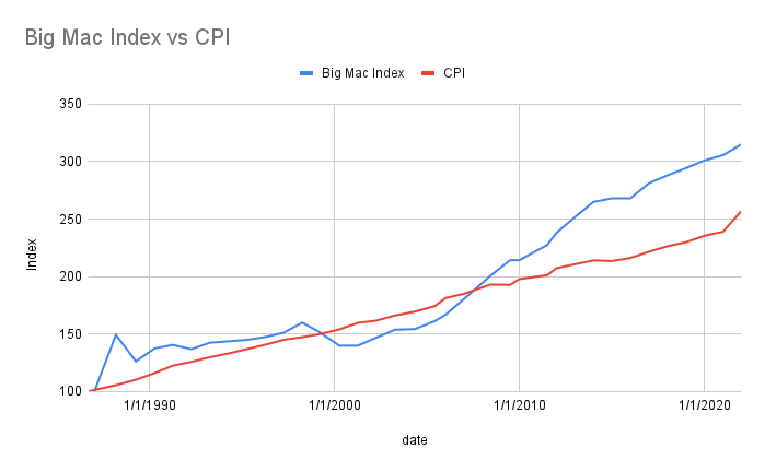
There is an odd divergence between the CPI and the Big Mac index right around the global financial crisis. I don’t know why that is. Maybe it’s because I graduated university. Or, it could just be a coincidence.
What I found more concerning is the magnitude of the gap between the two lines. The Big Mac index indicates that your dollars have lost 20% more value over this period than what the BLS is disclosing. In other words, if your salary kept up with inflation since the global financial crisis, you’re actually 20% poorer than you were in 2008. Coincidentally, based on the CPI, my $5 coffee should be around $6.66. Based on the Big Mac index it should be $7.85.